Disassociative
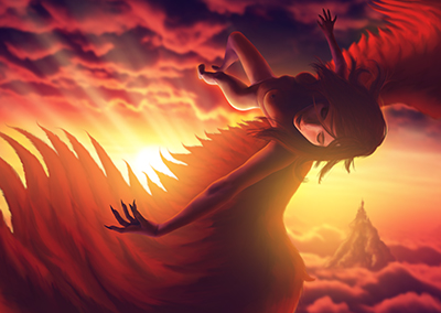
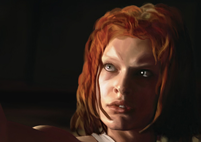
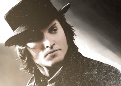
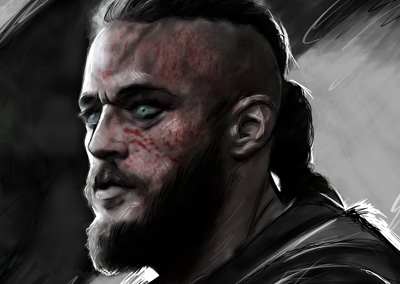
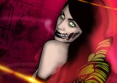
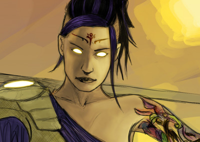
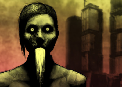
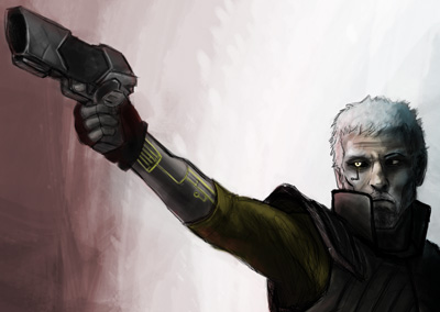
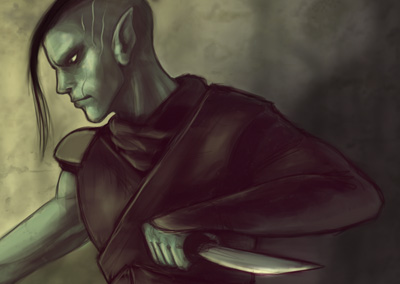
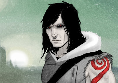
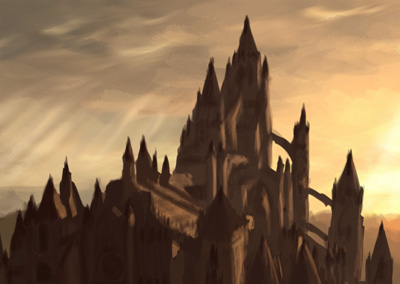
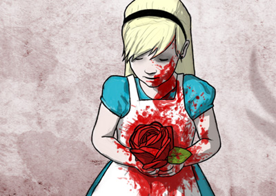
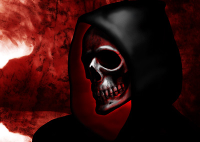
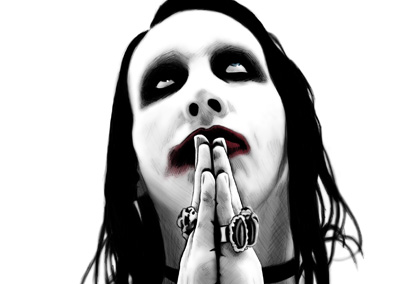
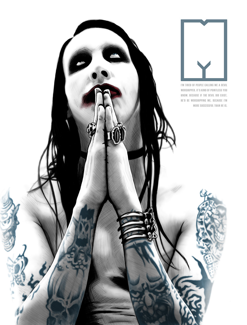
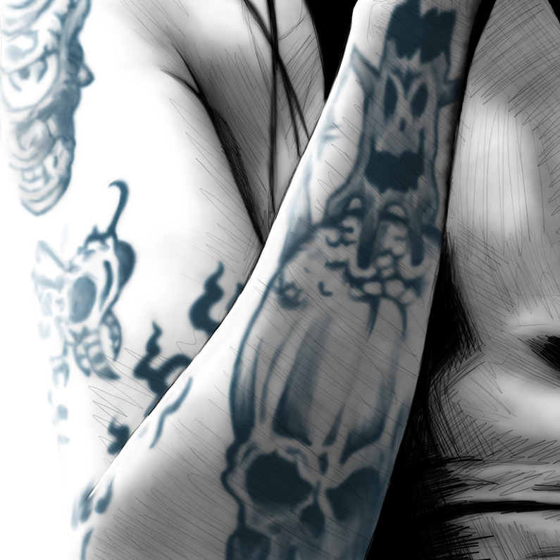
This is my first attempt at a more painted look. I hadn’t really researched techniques that other people used, or anything – it was just me trying to figure things out on my own. I blocked in areas with color, then used the Smudge tool to shape and blend. I left some sketchy lines in there because that’s still one of my favorite things about any of my pieces; I love that rough look.
The M in the upper right corner was kind of meant to resemble Manson on the cover of the Mechanical Animals album. I thought the bottom part of the letter looked very crotch-like o_o
While I like the outcome of this, I think I prefer some of the newer methods I’ve used where the brush strokes are visible.
